What Should a Creator Website Include? A Practical One-Page Checklist
A visitor lands on your site after seeing one piece of your work. Can they tell what else you make and whether they can buy it, commission it, or ask about a project? If the answer is buried in a list of social profiles, the site has left them to do the sorting.
A useful creator website starts with a clear introduction, selected work, a current priority, and a way to get in touch. You can fit that on one page and link to a shop or deeper archive when someone needs it. The hard part is choosing what deserves the first screen.
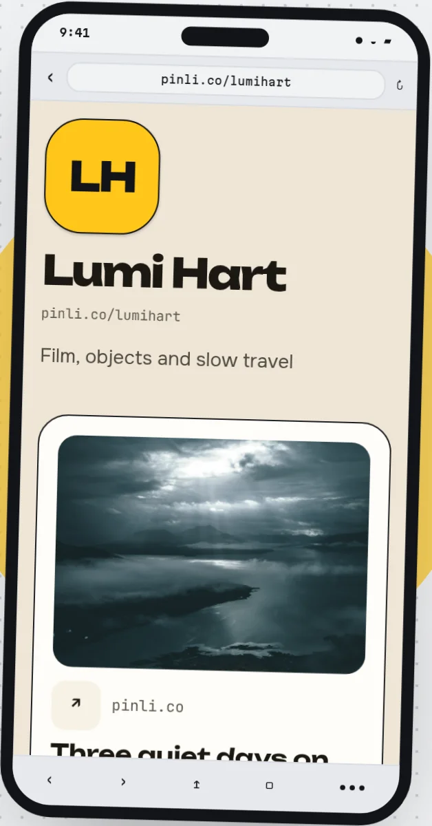
Decide who the page should help first
Write down the visitor you most want to serve this month and the question they will bring. “Can I commission this artist?” gives you a different page from “Where can I watch the latest episode?” You can still serve other visitors, but one clear priority helps you order the page.
Put your name or working name near the top. Follow it with a plain sentence about what you make and for whom. “I make hand-thrown tableware in Sarajevo” tells a new visitor more than “Welcome to my creative world.” If location matters to the work, include it. If it does not, leave it out.
The next element should show or explain the current reason to visit: a new collection, available commissions, a recent film, a newsletter issue, or a booking window. A visitor should not have to read an archive to discover what is happening now.
Show a few pieces that explain your work
A homepage does not need every project. Choose work that helps the visitor understand your range and the kind of work you want more of. If you have a large archive, select a few pieces for the first page and link to the rest.
Give each selected piece a line that answers a real question. What was it? What did you make or contribute? Where can someone see the full piece? If it was client work, check what you have permission to show. If you have a deeper archive, link to it instead of squeezing it all onto the first page.
Proof should fit the work. A filmmaker might show a short reel and name their role on each film. A maker might show close photographs, materials, and dimensions. A writer might link to published pieces with a sentence about the assignment. Use testimonials, client logos, or audience figures only when they are real, current, and yours to share. You do not need them to make a useful first page.
Explain what someone can do with you now
People should be able to tell whether you are taking commissions, available for collaborations, selling through an existing shop, or simply sharing work. Say what is open and what happens next.
“Ask about a ceramic commission” is more useful than “Work with me” if commissions are what you offer. Add the details that save an unnecessary exchange: the type of work you accept, a rough lead time if you know it, and what someone should include in the first message. If you are not accepting new work, say so and give a sensible alternative, such as a shop link or a date when enquiries reopen.
Do not imply a form confirms a booking or a purchase if it only starts a conversation. Name the action so the visitor knows what will happen after submitting it.
Make contact easy, then offer a way to stay in touch
Put a visible contact route close to the work or offer it supports. A collaboration enquiry can ask for a project outline, timing, and a reply address. A general contact link can be simpler. If you use a form, send a test message and check where it arrives. An email address can be a useful fallback.
A newsletter is optional. Add a signup when you have something worth sending and can say what subscribers will receive: studio updates once a month, new essays, release notes, or early notice of collection drops. “Join my newsletter” alone gives little reason to hand over an address. If your audience already follows you elsewhere and you cannot maintain a list yet, leave this part for later.
Social links are useful for visitors who want to keep watching your work. They should not be the only route to a question your website could answer directly. A visitor who wants to ask about a commission should not have to hunt through Instagram posts for an email address.
Two possible one-page arrangements
The same basic pieces move into a different order when the visitor arrives with a different question.
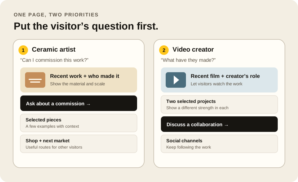
A ceramic artist taking commissions could lead with a photograph of recent work, a one-sentence description of the practice, and a clear commission enquiry. Below that, a few pieces can show size and material, followed by a link to the existing shop and the next market date. A long archive can live elsewhere.
A video creator seeking collaborators might lead with a recent film and their role in making it. Two more selected projects can show different strengths. A short note can explain the kinds of projects they want, followed by a collaboration contact route. Their latest social posts can be secondary to the work a partner needs to assess.
If you are using a link-in-bio page as your website, the same choice applies. A short list of links may be enough when each destination explains itself. Images and notes become useful when someone needs to see the work before choosing a route. For the smaller profile-link question, see what a link in bio does.
Read the page on a phone
Open the page on a phone before you share it. Look at the first screen without scrolling. Can a stranger tell whose page it is, what you do, and where to go next? Then follow the main path with your thumb. Check that the work is legible, the important links are easy to tap, and a form does not demand more information than it needs.
Write link labels that describe their destination or action. The W3C's guidance on link purpose explains why that matters for people navigating by links. Give informative work images text alternatives that convey what the image contributes, following W3C's image guidance. If a photograph is essential to understanding the work, do not leave its meaning only in the image.
You can arrange a separate phone layout in Pinli's creator page builder, but the test matters whichever tool you use: open the published address, follow the links, and submit a test enquiry. An editor preview cannot tell you whether the visitor's full journey works.
A launch checklist you can actually finish
- Can a new visitor identify you and your work from the first screen?
- Does the page show a few selected pieces with enough context to understand them?
- Is the current offer or priority clear, including whether it is open now?
- Can someone contact you or complete the promised next action without guessing?
- Do link labels, images, and the phone reading order make sense outside the editor?
- Have you opened every important destination and tested any form yourself?
Once the page is live, review it when your work changes. Remove a closed booking window, update a market date, and move the new priority into view.